How to Create a Box and Whisker Plot on Excel
Creating a box and whisker plot on Excel is a valuable technique for visualizing data distribution and identifying outliers. This visually compelling chart helps you quickly understand the central tendency, spread, and variability of your dataset.
In this comprehensive guide, we will delve into the world of box and whisker plots, exploring their definition, history, and significance. We will then provide a step-by-step tutorial on how to create one using Microsoft Excel. Finally, we’ll discuss the latest trends and developments in box and whisker plot analysis, sharing expert advice and best practices.
Understanding Box and Whisker Plots
Definition
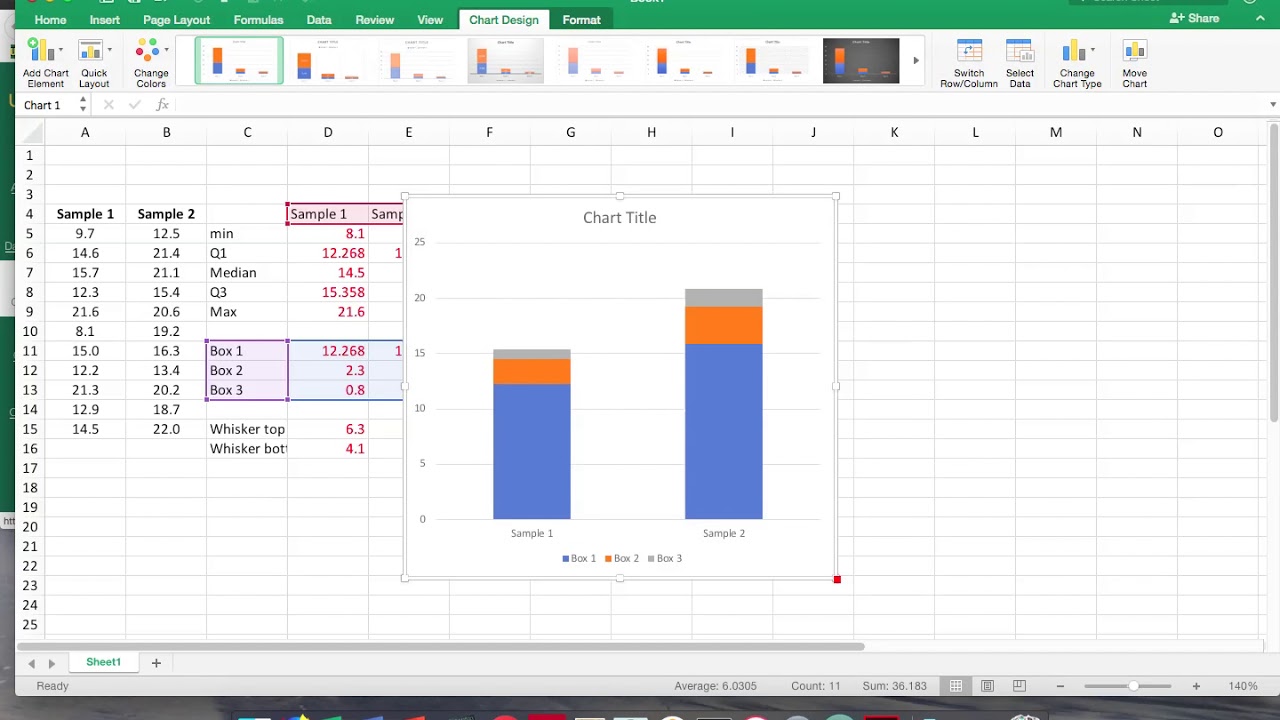
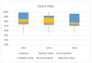
A box and whisker plot, also known as a box plot, is a graphical representation of the distribution of data. It visually summarizes the five-number summary of a dataset: minimum, first quartile (Q1), median, third quartile (Q3), and maximum.
History
The concept of box and whisker plots was first introduced by John W. Tukey in 1977. Tukey sought to create a graphical tool that could effectively convey the central tendency and spread of data, helping researchers identify outliers and patterns.
Meaning
Box and whisker plots offer several key insights into data distribution:
- Central Tendency: The median line indicates the midpoint of the data, dividing the dataset into two halves.
- Spread: The length of the box represents the interquartile range (IQR), which measures the variability of the middle 50% of the data.
- Outliers: Data points that fall outside the whiskers, which extend to 1.5 times the IQR, are considered outliers and may warrant further investigation.
Tutorial: Creating a Box and Whisker Plot on Excel
Follow these simple steps to create a box and whisker plot in Excel:
- Input your data into Excel, ensuring the dataset is organized in a single column.
- Select the data column.
- Go to the “Insert” tab.
- Click on the “Insert Statistics Chart” button.
- Choose “Box and Whisker” from the chart options.
Latest Trends and Developments
The field of box and whisker plot analysis is continuously evolving, with new advancements and applications emerging:
- Interactive Box Plots: Modern data visualization tools allow users to interact with box plots, enabling them to explore data patterns and filter outliers dynamically.
- Comparative Box Plots: By comparing multiple box plots side-by-side, analysts can identify differences in data distribution between groups or over time.
- Applications in Machine Learning: Box plots are increasingly used in machine learning algorithms for data exploration and anomaly detection.
Tips and Expert Advice
To enhance your box and whisker plot analysis, consider these expert tips:
- Use Appropriate Data: Box plots are suitable for continuous data and should have a reasonable sample size to ensure accurate representation.
- Consider Transformations: If the data distribution is skewed, data transformation techniques, such as log or square root transformation, can improve the symmetry of the box plot.
- Interpret with Caution: Outliers should be interpreted with caution, as they may represent genuine extreme values or data errors.
FAQ on Box and Whisker Plots
Q: What is the difference between a box and whisker plot and a histogram?
A: Box and whisker plots provide a different perspective on data distribution compared to histograms. While histograms show the frequency distribution, box plots emphasize the five-number summary and outliers.
Q: How can I modify the appearance of a box and whisker plot in Excel?
A: You can customize various aspects of the box plot, including colors, line styles, and labels, using the “Format” options in Excel.
Conclusion
Creating and interpreting box and whisker plots on Excel is a valuable skill that empowers you to analyze and visualize data effectively. By understanding the concepts, trends, and best practices discussed in this article, you can leverage box plots to gain insights into your data and make informed decisions.
Now, let us know: Are you ready to explore the world of data visualization and unleash the power of box and whisker plots in your analysis?

Image: www.educba.com

Image: www.intellspot.com
Box and Whisker Plot in Excel (In Simple Steps) For Excel 2019, Excel 2016, or Excel for Microsoft 365, make a box and whisker plot chart using the Insert Chart tool. Enter the data you want to use to create a box and whisker chart into columns and rows on the worksheet. This can be a single data series or multiple data series. Select the data you want to use to make the chart.